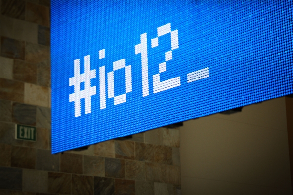
Pictured: Google+ visualizer LED wall at io2012 The Google I/O 2012 conference made waves this year when it showcased what was easily the most ambitious tech demo to date. As developers posted en masse about skydivers, BMX bikers, and climbers delivering Google Glass to the keynote, a giant LED wall in the conference hall shared the enthusiasm in real time. The UX Lab at Instrument in Portland, Oregon installed a custom Google+ visualizer on a sixty foot wide, large pitch, low resolution screen. I was invited by the UX Lab's Design Director, Martin Linde, into the project to take up motion programming duties. Here's how it works. When anyone posted to Google+ using certain hashtags, they were picked up by a very actively monitored account. Lead developer Gabe Paez and I assembled a Cinder application which pulled in the account's activity. When a new post arrives, the application "searches" for the user, either by name or by photo. After selecting them, it opens the content. This can be a post, comment, re-share, attachment, or pretty much anything else a Google+ activity stream might contain. Gabe handled the data and sequencing development. I handled coding the visual side. The large pitch of the screen lent itself to a low-tech, pixelated interface. All the text is "typed out" or "deleted" as if from a command line. Images are displayed using a progressive download effect. This effect is also used to transition between states. While this installation didn't don a wingsuit or scale a wall, it was still something of a centerpiece at the conference. It encouraged people to tack #io12 onto their posts in the hopes they would make an appearance on the screen. Jump to 1:20 or click here to view on YouTube

